.png?width=1200&height=563&name=image%20(4).png "image (4)")


Your brand isn’t just your logo. It’s your whole identity as a business. It is critical that as a property manager you have your own unique style that doesn’t blend in with all the competition and compliments your USP.
Whether you have an existing brand or just an idea for your first one, ask yourself this: does it appeal to my target audience? If it doesn’t then you perhaps should head on back to the drawing board.
If your properties are primarily small, 1/2 bed apartments in a city like London or Manchester, then you will probably want to focus on targeting young adults. Younger people are typically attracted to more dynamic branding, so your branding should be just that. Older generations tend to want assurances that you are dependable, knowledgeable and trustworthy, so if this is your preferred audience then your branding should reflect that and maybe not be as flashy.
As humans, we are programmed to make assumptions based on what a brand looks like before knowing the full story. It’s not a bad idea to go along with some traditional characteristics that your target audience is known to resonate with.
Here are three key components of branding that should be geared towards your ideal customer.
Logo
A logo, often called a ‘bug’ in the industry, is obviously extremely important for your brand. It has to be unique to you and should be recognisable at speed. Consider if your current logo conveys the right message for your audience. If it doesn’t, it could be time to change it.
There are different styles of logos, one such is an icon style. In the property sector, an icon could be in the shape of a house. Another type is a logo based on typography. A prime example of this is using your company initials. Many brands combine the two and incorporate a related image concept into or amongst letters.
Another thing to bear in mind is that your design should work in the real world. Not only should it work on your website, but on things like t-shirts, business cards, notepads etc. It should therefore not be too complicated so it can look smart across multiple mediums.
When thinking about what design your logo should be, think about the psychological effect it will have:
- Sharp, straight-lined shapes tend to project stability and balance. These sturdy shapes can build trust just from the shape. These are ideal for attracting an older audience.
- Rounded icons are softer and as a result, are often seen as youthful.
- Circular and elliptical shapes are often seen as a symbol of love and commitment. Think wedding rings. Perhaps if your audience is families then a more rounded look is the best option.
Example:
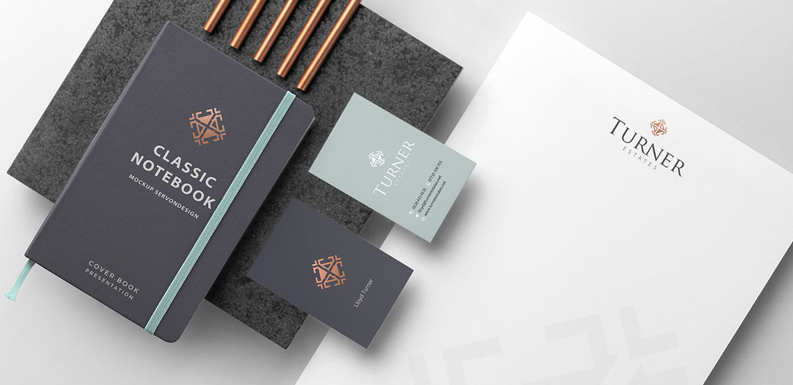
One of our property manager clients, Turner Property, specialises in student accommodation. We worked with them and came to the conclusion that they shouldn’t actually target the students themselves, but the students’ parents. The parents often supply money towards the property their child was going to be living in and therefore are heavily invested in where their money is going.
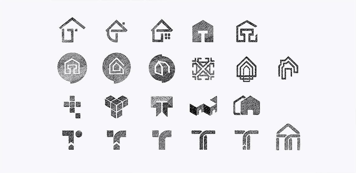
We designed a variety of bugs, and it was decided that a sharp, classical bug would build the parent’s trust in the brand best. The logo features four house icons, establishing that the company works in the property market without directly spelling it out. It is simple enough to look good on day-to-day items and its shape is recognisable to work without colour if necessary.

Tagline
Your tagline goes hand in hand with your logo. This is your company name, the text that goes alongside your logo. Its aim is to compliment your logo and maintain the style you’ve gone with. If it doesn’t, the brand can look out of sorts and tacky. It is important that you select the correct font for your brand.
In a rebrand, the tagline can sometimes be forgotten about. Businesses will occasionally change their logos and keep the tagline the same as before. A rebrand should be treated as a total change up, so bear this in mind when changing your logo.
One decision is choosing between a serif and a sans-serif tagline. This goes back to the round vs sharp psychology mentioned above:
- Serif fonts are often associated with quality and traditional high standards and are generally more appealing to older generations.
- Sans-serif fonts, on the other hand, are used in more contemporary branding, so maybe this is a better choice when aiming at younger people.
Example:
To establish authority and to remain consistent with the bug, a serif font was chosen for Turner Property. If we had gone with a different bug, the tagline style could have looked very different, but wouldn’t have suited the target audience as well.
Colour scheme
The colour scheme is also crucial to your brand’s identity. It can make you stand out or make you blend in. Well thought out colour choices can portray what you are all about and make you instantly recognisable.
In the property market, you will often see blues and purples used. You might already use one of these in your colour scheme. These colours convey reliability and prestige. When picking your new brand, you can choose to keep with this tried and tested look, or you can opt for something a bit more unique. Whichever colours you decide to use, think about your target audience and try to avoid colours your direct competitors are using.
Example:
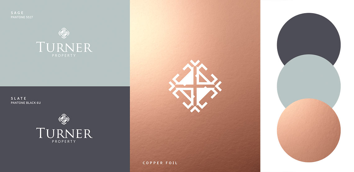
Turner Property’s colour scheme was made up of greys, green and copper. The grey adds a sleek, fashionable and smart look to the brand. Connotations of green include stability and balance, positive characteristics that Turner Property was aiming to portray. The copper colour represents wealth and therefore is perceived as trustworthy. The colours aren’t brash and work well together to appeal to the target audience.
Conclusion
By using this new branding specifically targeted at their ideal customer, Turner Property have created a look of a reputable, trustworthy property manager which perfectly reflects their services and allows them to get the types of customers they want.
How you brand yourself is extremely important to ensure success. Paired with clever marketing, you can hone down on your target audience to generate more quality leads.
If you want help creating or changing your property manager branding then we know of experts that can help you, so get in touch.
This article was provided by Kevin Williams. As one of the founders of Servon Design, Kevin has more than two decades of digital marketing and branding experience in the property sector. He focuses on helping Landlords, Property Managers and Letting Agents not only generate leads through digital marketing but also helps improve their online brand and presence.
Written by Kevin Williams, Director at Servon Design Limited